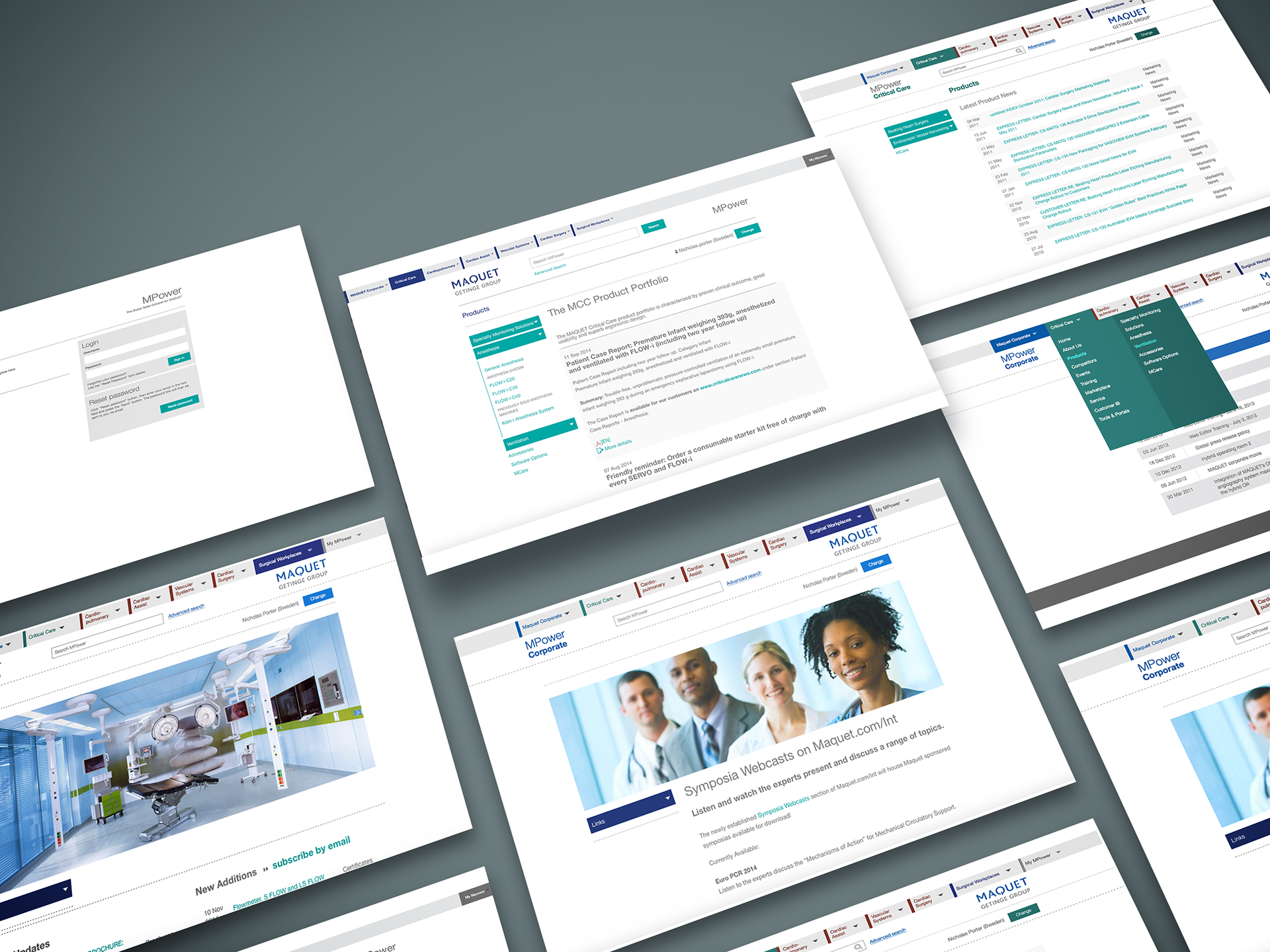
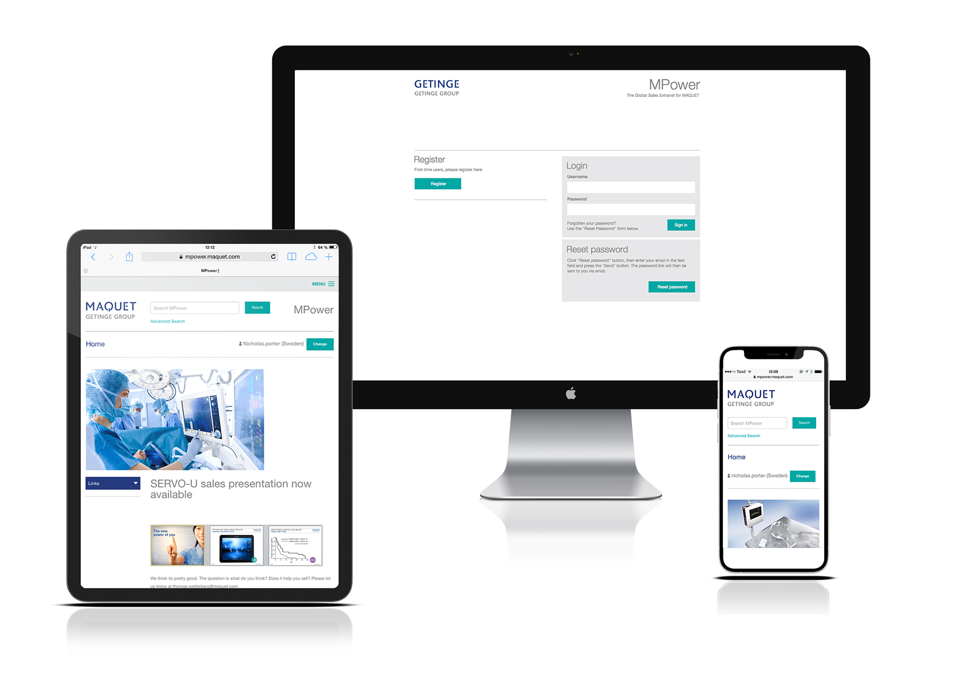
The MPower sales portal for Maquet Critical Care (Getinge) was one of the most challenging projects I have worked, on from a design perspective. It was also deeply satisfying. The brief was to take a hugely complex online sales tool, covering multiple business and product areas, and radically simplify the user experience. In other words, to create an intuitive and easily navigable intranet by the simple application of good design principles, in the wake a total overhaul of the company's visual identity.
The new visual identity
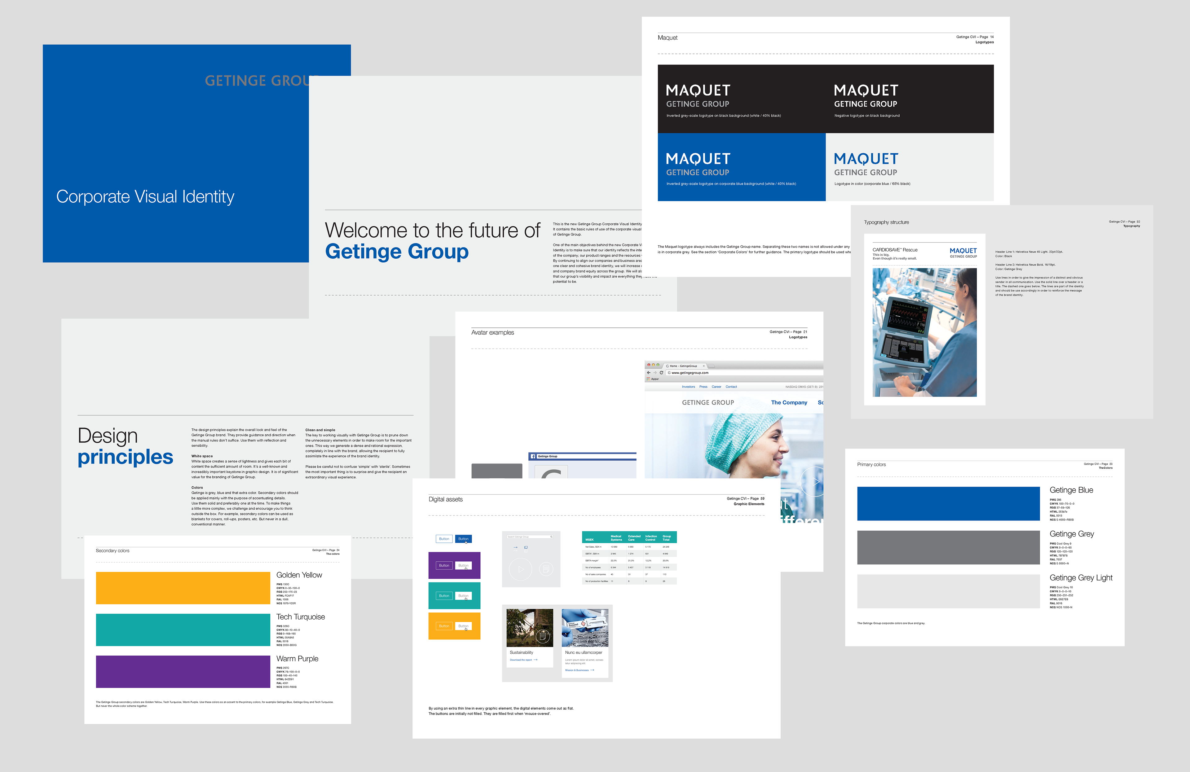
The new corporate visual identity delivered by an agency of repute was modern and simple, with clean, straight lines and a clear grid system, with plenty of white space, vibrant corporate colours and legible typography. But with over seventy pages of guidelines, not one touched on digital implementation. We needed to interpret the new visual system to work across digital platforms with a high level of complexity, multiple user profiles, thousands of products and seven levels of navigation.
Flat design
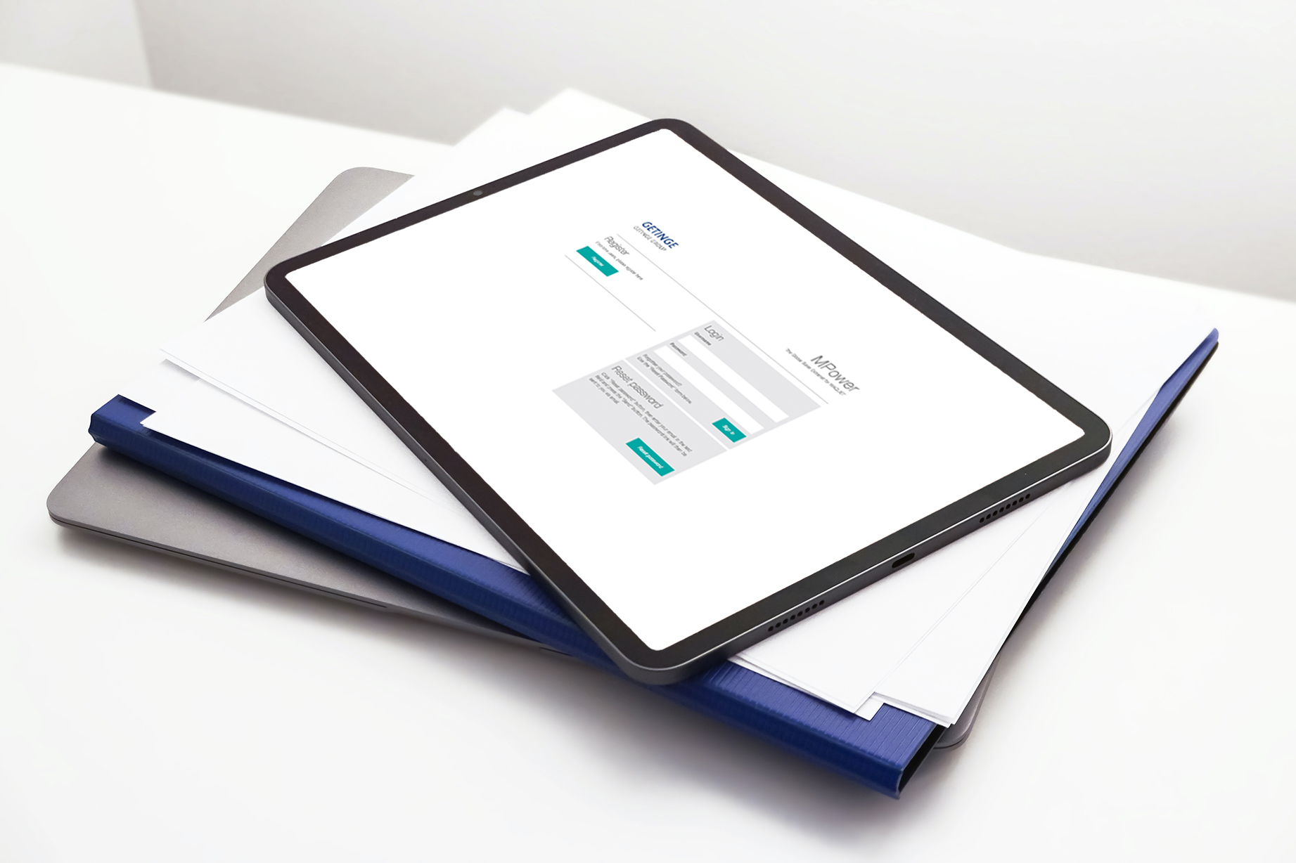
Our solution was to go flat. Apple and Microsoft had both recently released their new flat UI design concepts, and Google and Android were also exploring this style, emphasizing minimalist use of simple elements, typography and flat colours. We knew that to give the end user the most intuitive experience, the design should be almost invisible, just enough to give hints and guidance, displaying the content in a simple, intelligent way. Even the new login screen to the new MPower portal would make a bold statement.
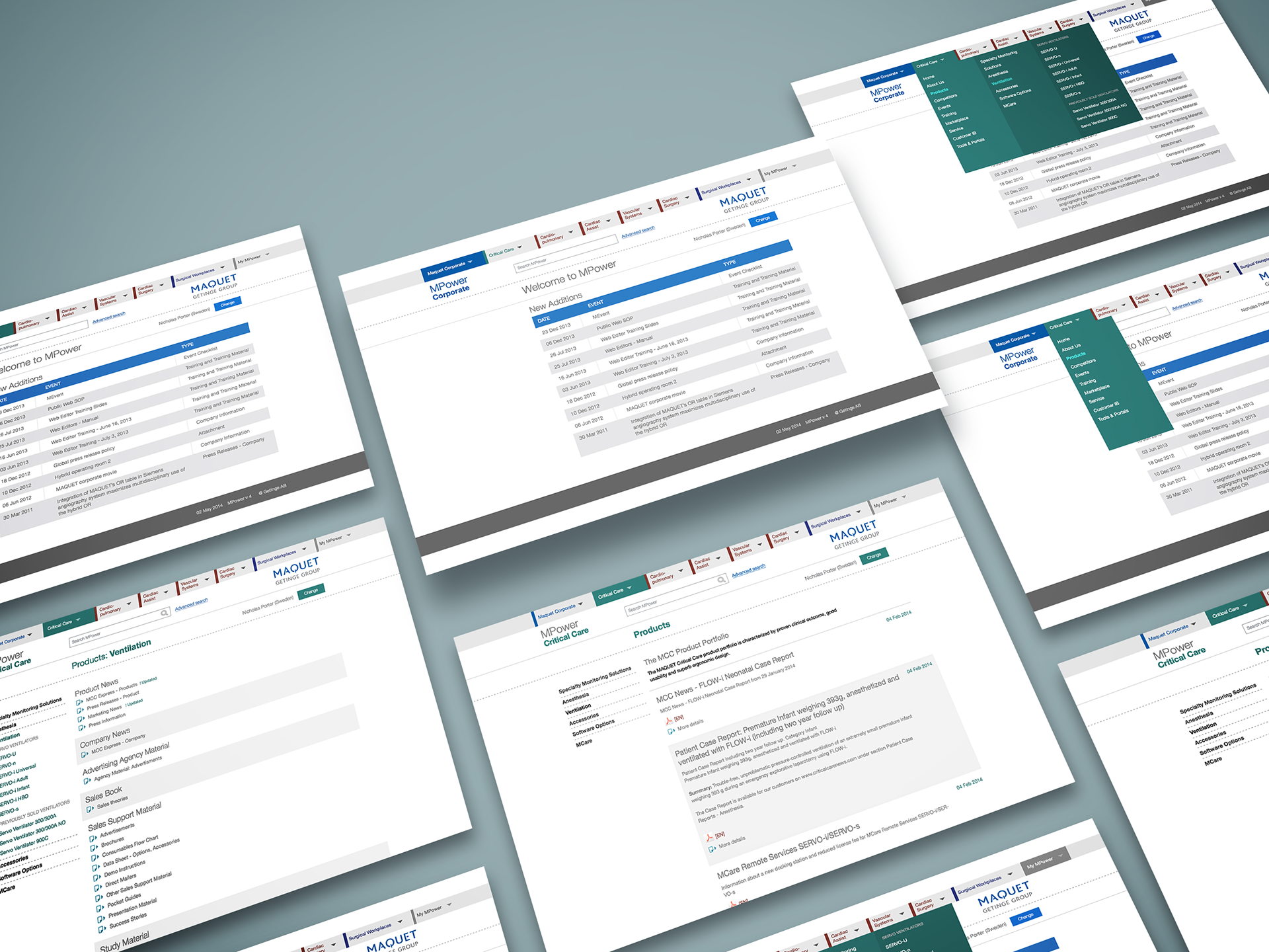
Colour coding
The different business areas of Maquet Critical Care were colour coded for ease of navigation. The three main colours denoted Critical Care (green), Cardio-pulmonary (brown) and Surgical Workplaces (dark blue). Maquet corporate content was coded with the paler corporate blue.
A deeply satisfying and fun project to work on. Sometimes the more restrictions you have, the better you can realise your best work.