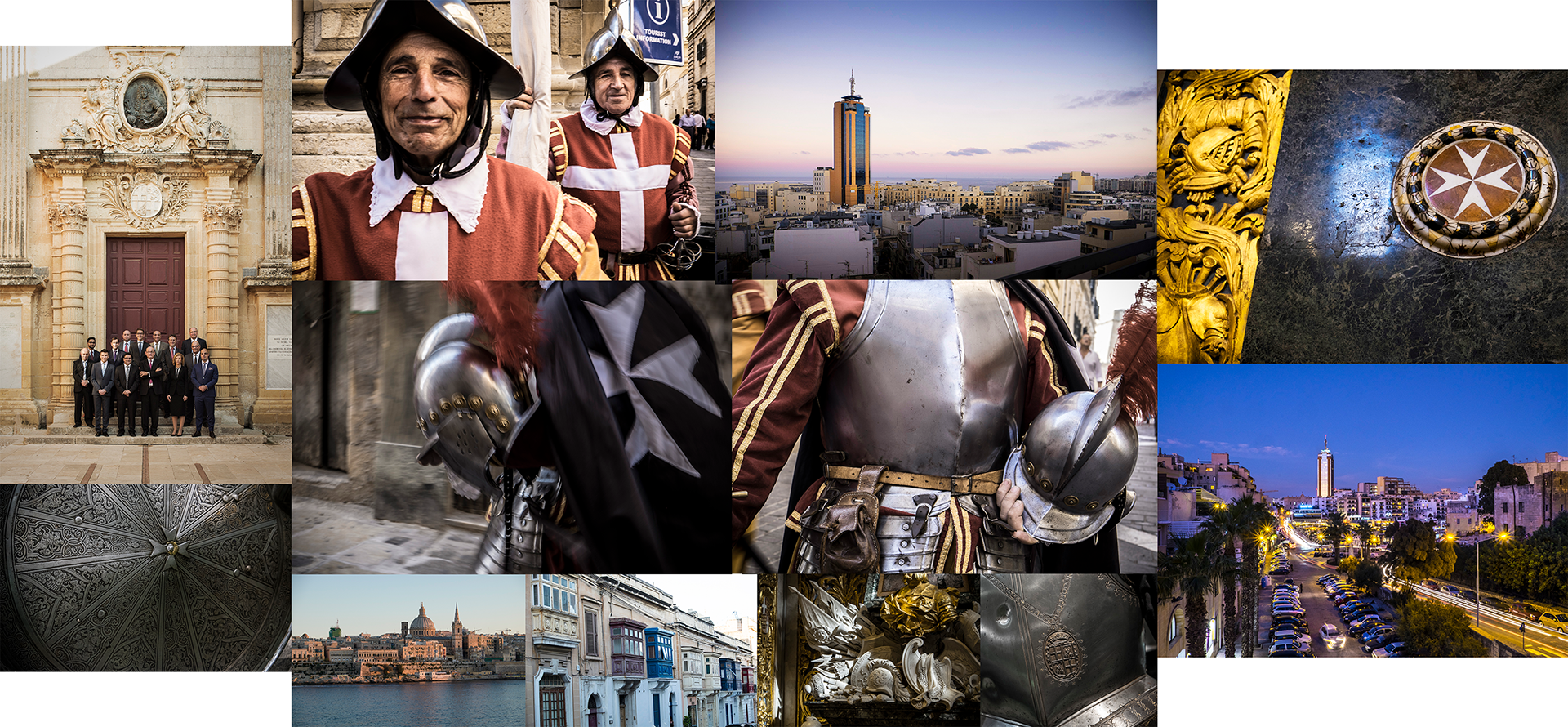
Branding system for Malta-based investment brokers Falcon Funds. They asked us to completely rebrand their pension fund offering, and to create all their marketing assets from scratch. We began by carrying out two photoshoots, one for location and cultural site imagery, and one for the personnel. These photos of historical and iconic locations around Malta, such as St Johns Co-Cathedral, were intended to anchor the brand firmly in its Maltese heritage.
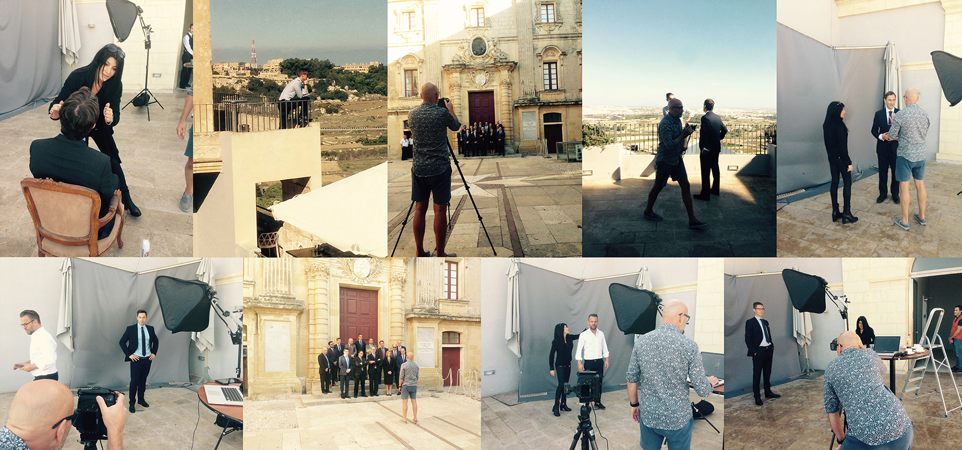
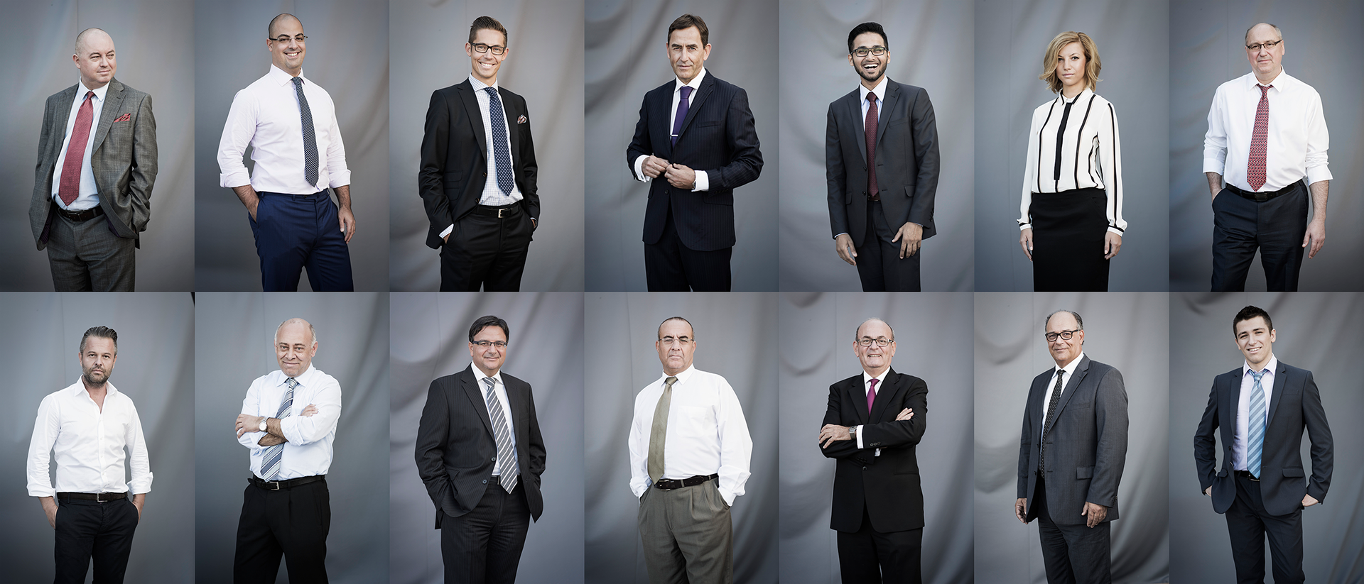
Personnel photoshoot
Work started with a Falcon Funds top management and consultant photoshoot in the walled city of Mdina, at The Xara Palace and Palace Vilhena, plus an second location shoot in Valletta and surrounds to get unique images for the new website, carried out with photographer Johan Annerfelt.
Logotype development
In parallel with this we began the profile design work; the client wanted to portray a feeling of stability and trust. The name Falcon Funds gave us a clear place to begin, and we developed a stylised falcon graphic incorporating a graded, triangular grid pattern to suggest the many faceted nature of pension fund investment. The icon was intended to embody dynamism, agility and assertiveness.
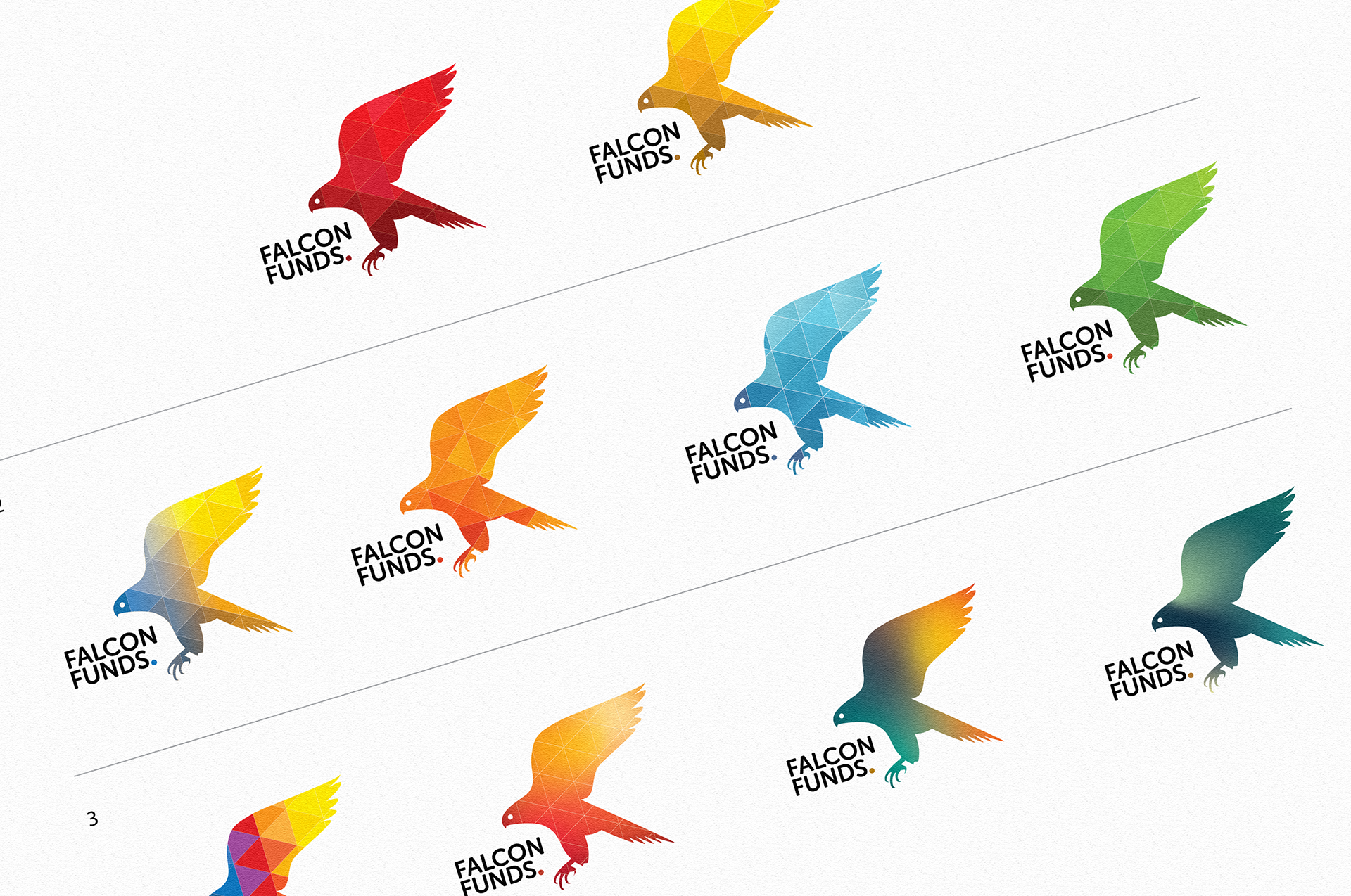
We tried a number of different variations on the falcon symbol, and we tested them on the company employees and board to gauge reactions and preference. But we already knew what the final choice was likely to be, given the colours of the Maltese flag...
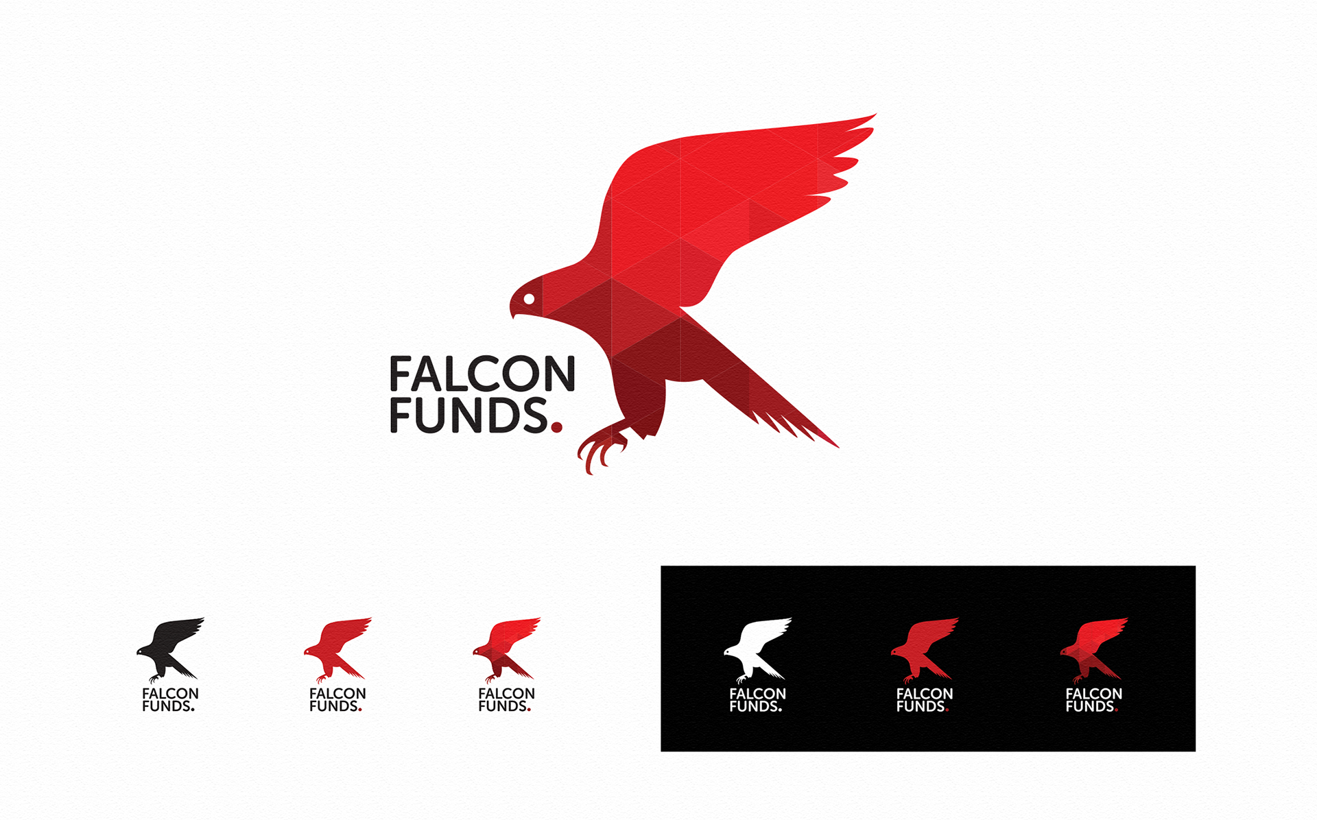
Corporate identity system
Once the logo was established, we began rolling out the new corporate identity, developing the brand guidelines and visual systems, which were implemented on the website and all marketing materials and other assets. The brand guidelines specified exactly how every aspect of the company was to appear. Every customer touchpoint needed to feel premium, down to the choice of letterhead and envelope paper, and the card weight of the business cards themselves.
We created a very stark colour palette, comprising white, varying shades of Maltese red, and black, reflecting the Maltese national flag. Central to our design was a triangular grid pattern, which permeated all design elements, from the business card reverse to the falcon icon's colour fill, as well as letterhead and envelope edgings, navigation elements and even as a transparent overlay over site header images.
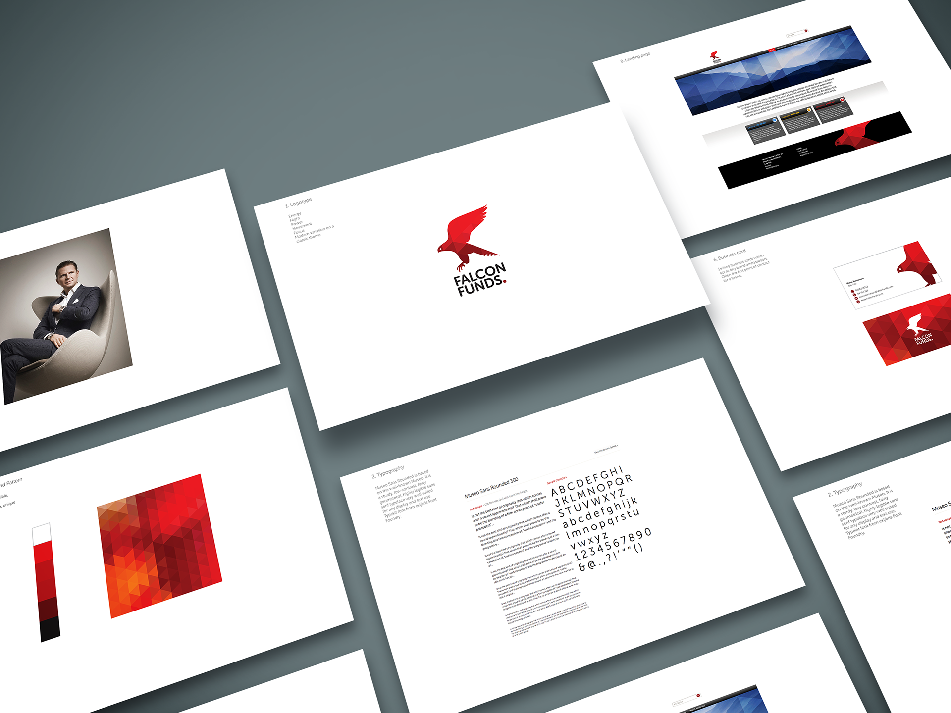
Website design
Work also began on the website construction, with all content created by us. Pulling all the elements of the brand together is always a satisfying job, and proof of the validity of the concept, and the module library containing all the designed elements was soon delivered to the front end developers.
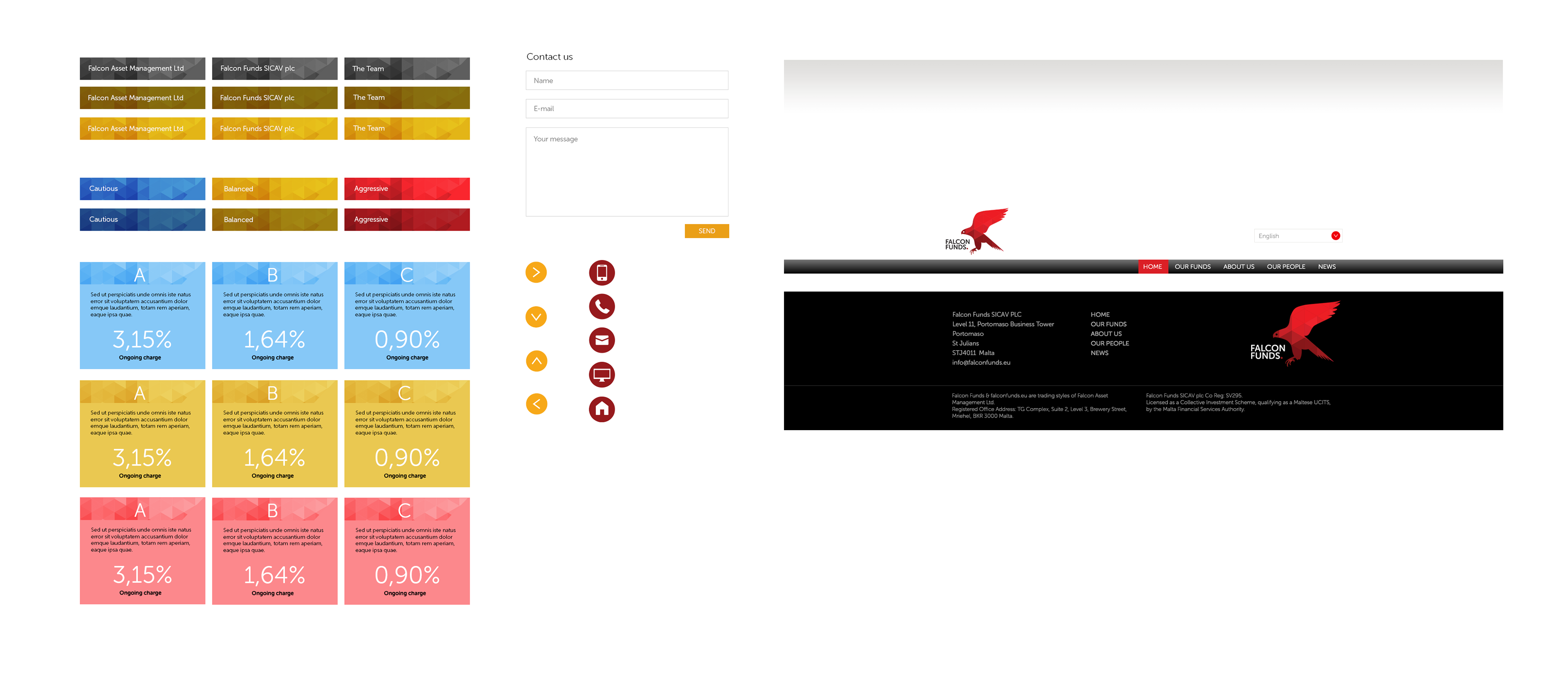
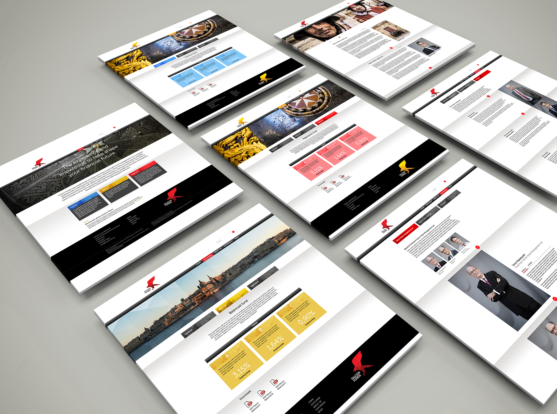
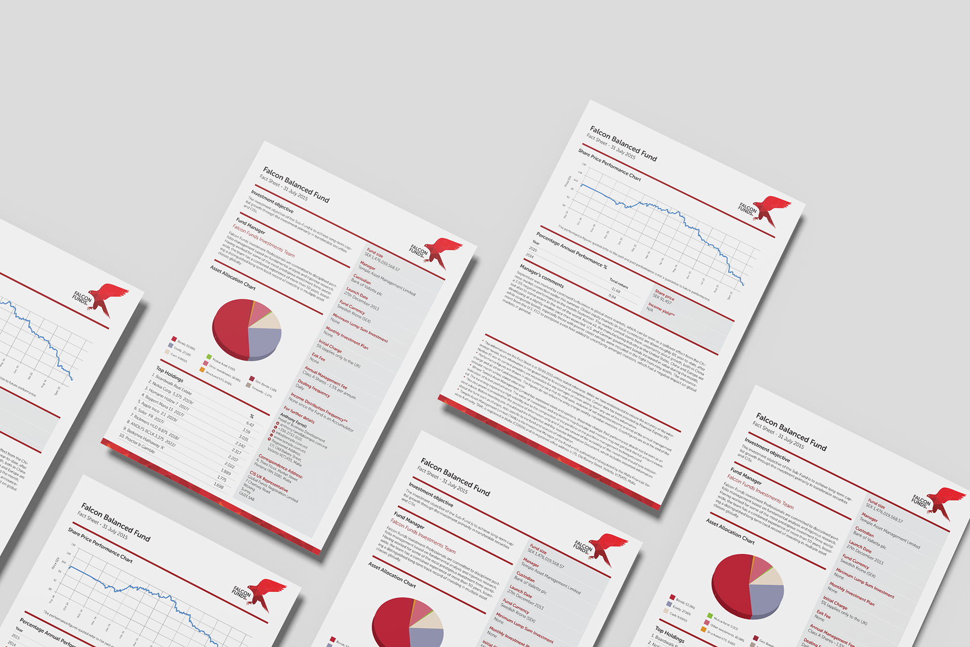
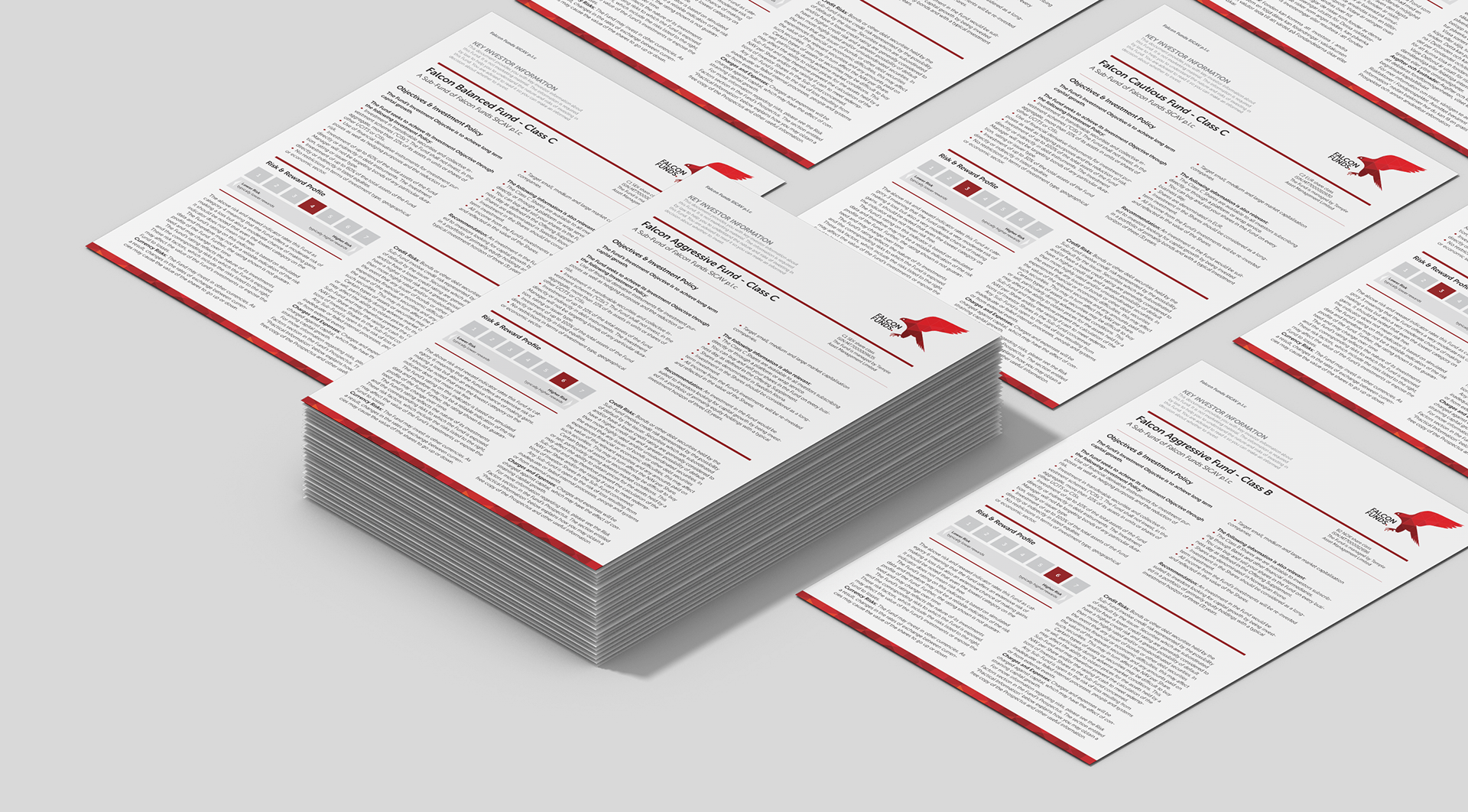
The website was constructed to allow visitors to access information based on their preference for investment type: Cautious, Balanced or Aggressive, and then to supply them with investor information in the form of downloadable KIIDs (Key Investor Information Document) pdf documents, which we had also designed.
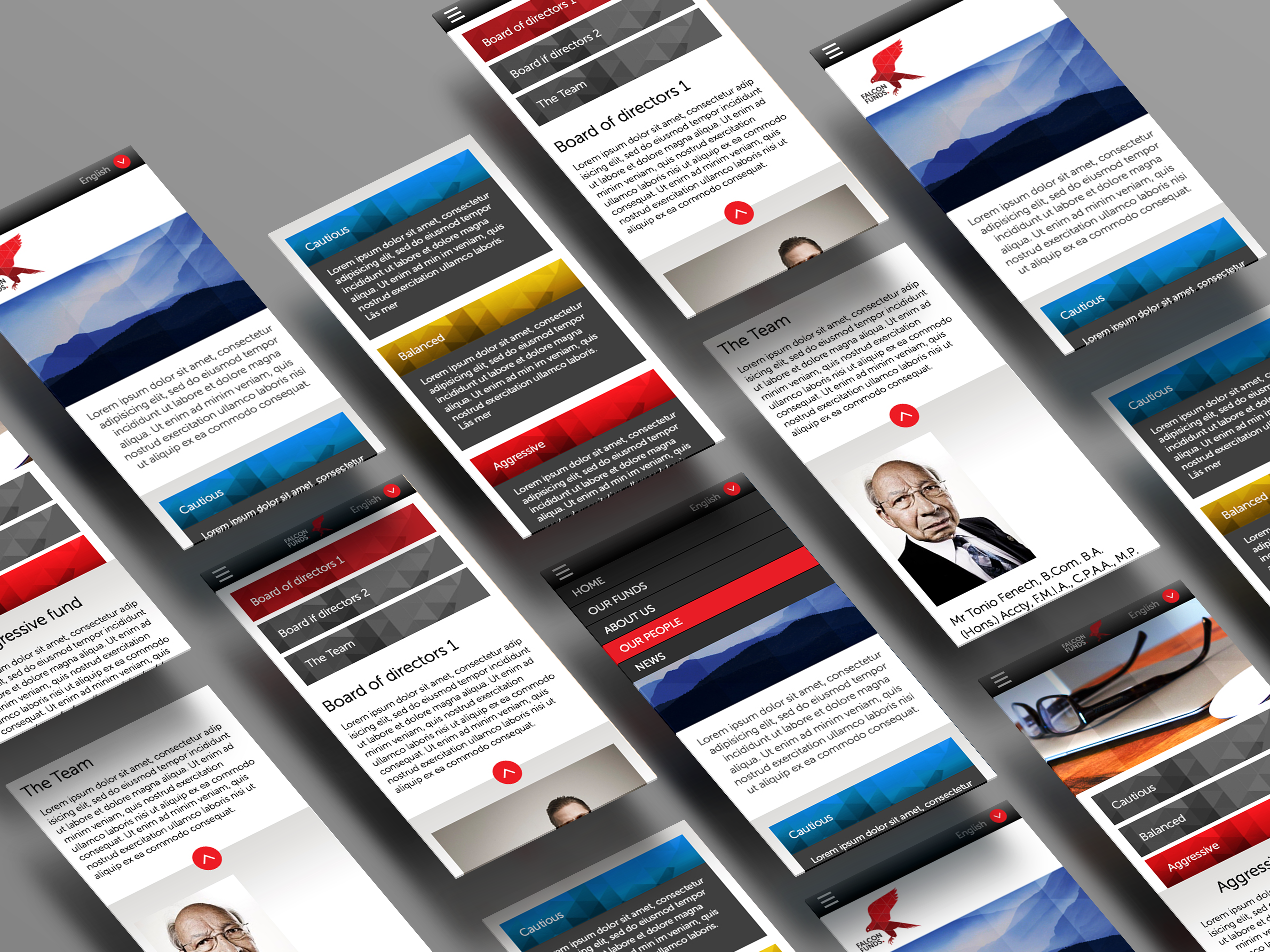
The website naturally needed to function seamlessly on mobile.
Branded material
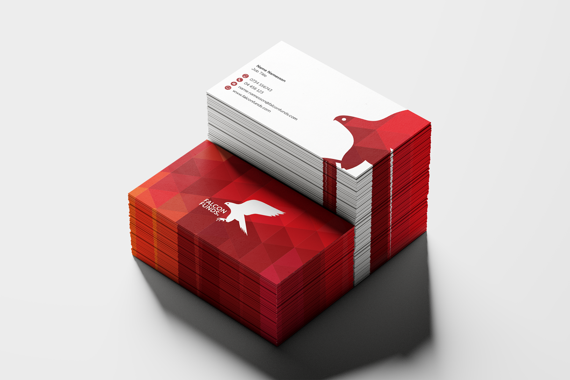
The triangular grid pattern is clearly visible on both the front and back of the business cards.
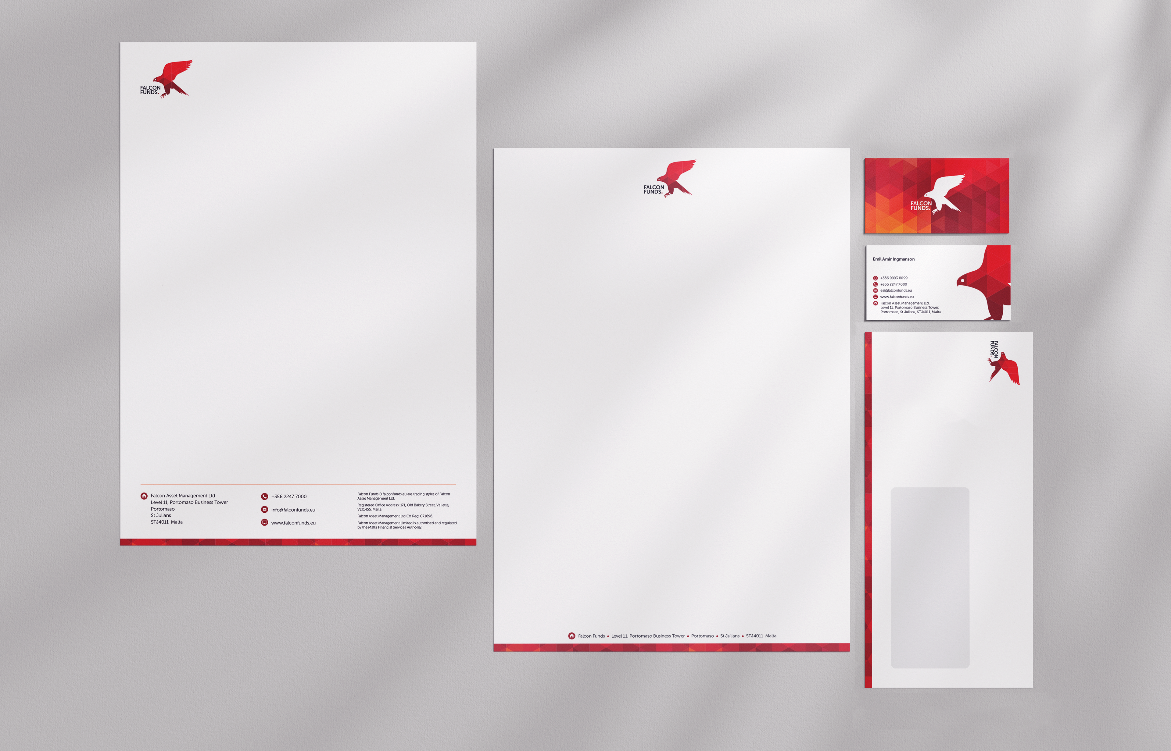
We created all the usual stuff; email signatures, letterheads, notepads, envelopes etc, as well as the factsheets and KIIDs (Key Investor Information Document) to fit seamlessly with the new brand platform.