The website we created for Entercash was part of a total rebranding carried out for this challenger Fintech company, operating in the instant bank payments arena, and challenging established giants like Paypal and Trustly. They had a great product, but they lacked a serious and coherent brand to communicate their offer. The website would be their window to the world, but we had to determine the size, shape and colour of that window first.
This project was carried out through my web partnership March, which is myself and developer Mikael Hulkko. I was responsible for all the design, branding and content, while Micke took care of front and back end development, as well as some work on the product design itself.
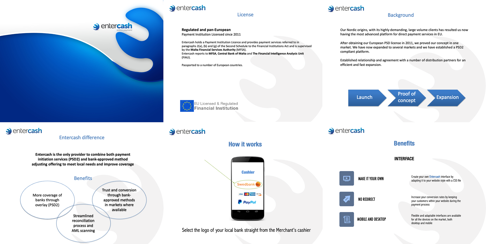
This was how Entercash were presenting themselves to the world. They had a product presentation created from the perspective of tech developers, but they had no real idea how to market themselves. They did have a logotype, though, which they wanted to retain, but everything else was up for grabs.
The first thing we did was hold a branding workshop with all the key stakeholders, to establish exactly where they wanted to be in three years time, and how we would get them there.
Next steps were to look at the website we were going to create for them. We started with a high level project outline, to explain the steps we were going to be taking, and some preliminary thinking.
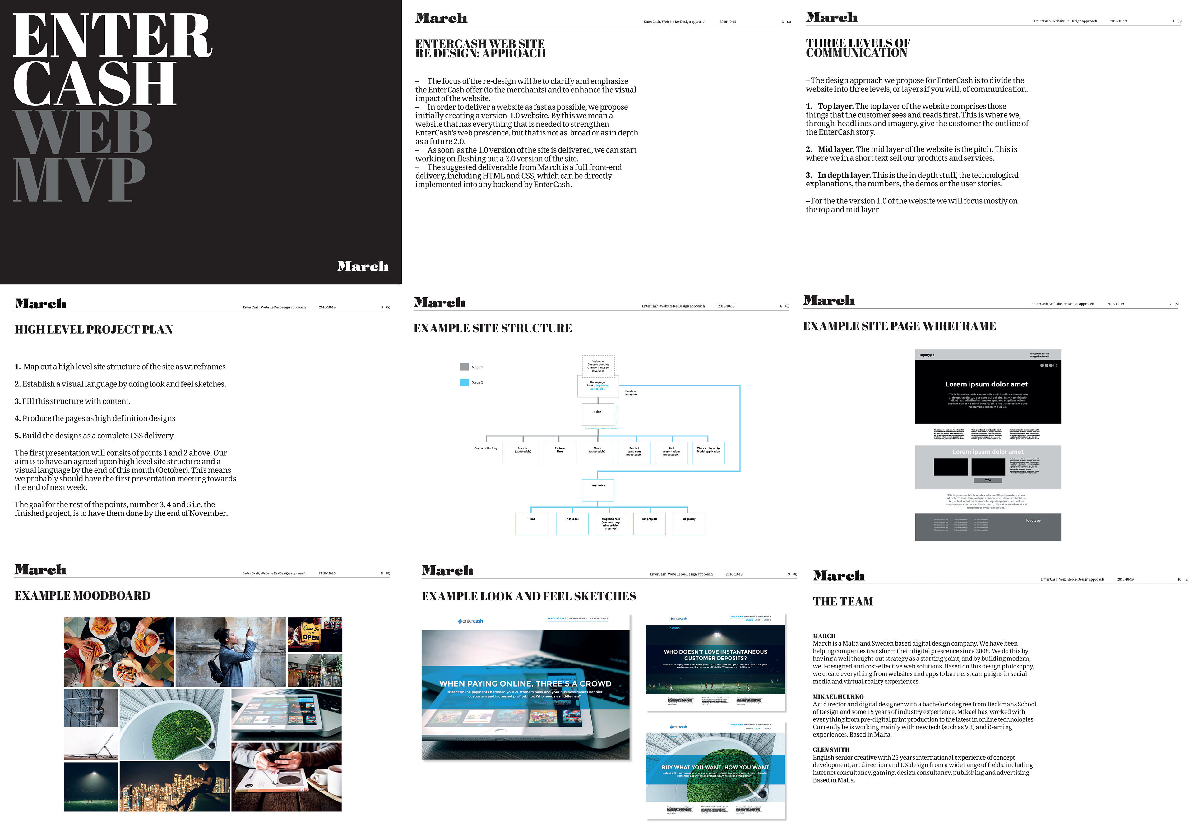
This proposal was very well received, and we were given the go-ahead to start looking at the site architecture. We had a clear roadmap for the site goals, and the design sketches and moodboard I had developed were very much in line with what the client were expecting.
We had a number of workshops with the client to determine the site structure and the different target audiences which the site would be serving. Then we began the wireframe prototyping, which was a fairly quick job due to the level of alignment between us and the key stakeholders on the client side.
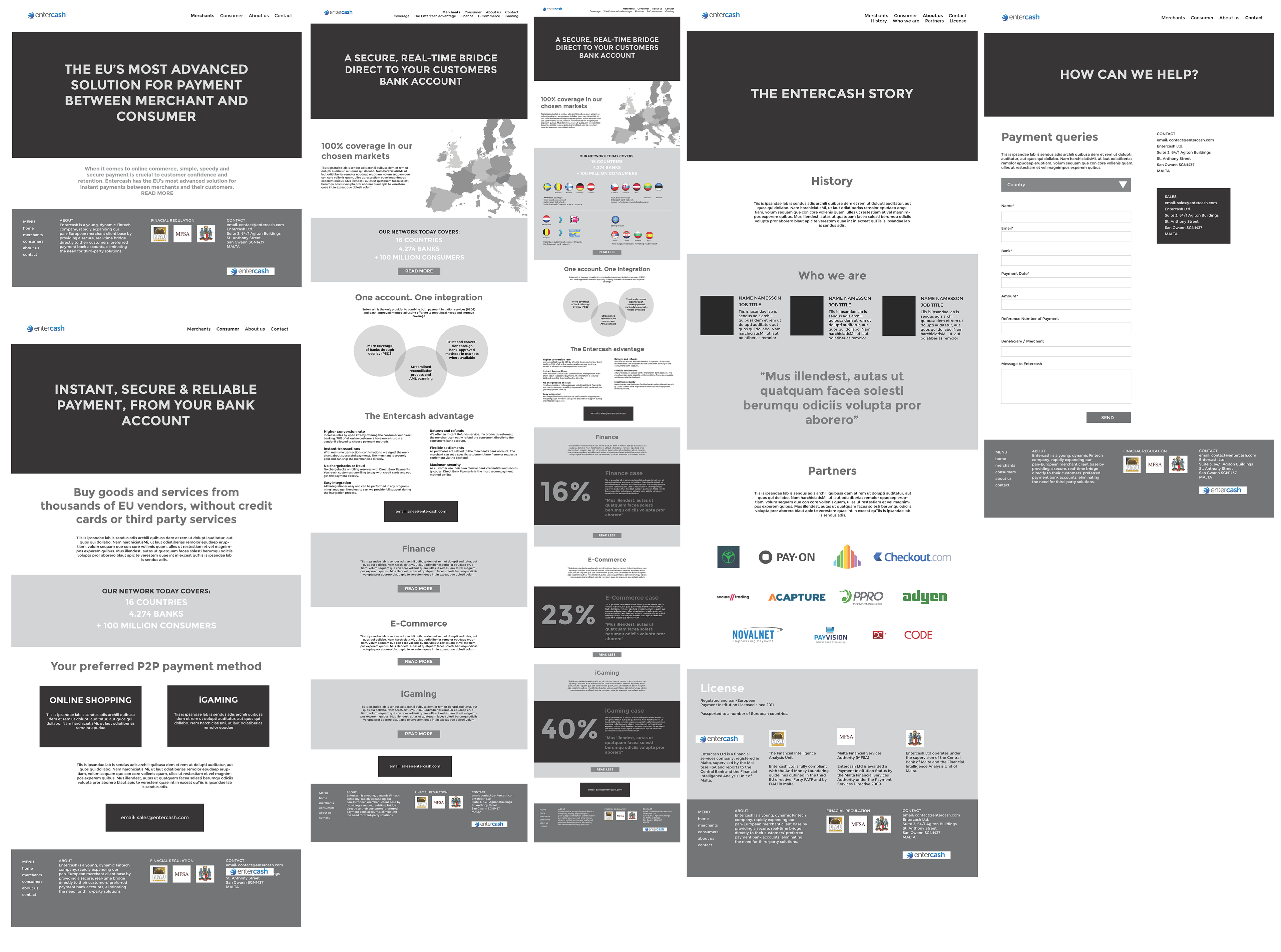
I was also busy writing the site content, so we used real copy in the wireframe to test the logic and flows.
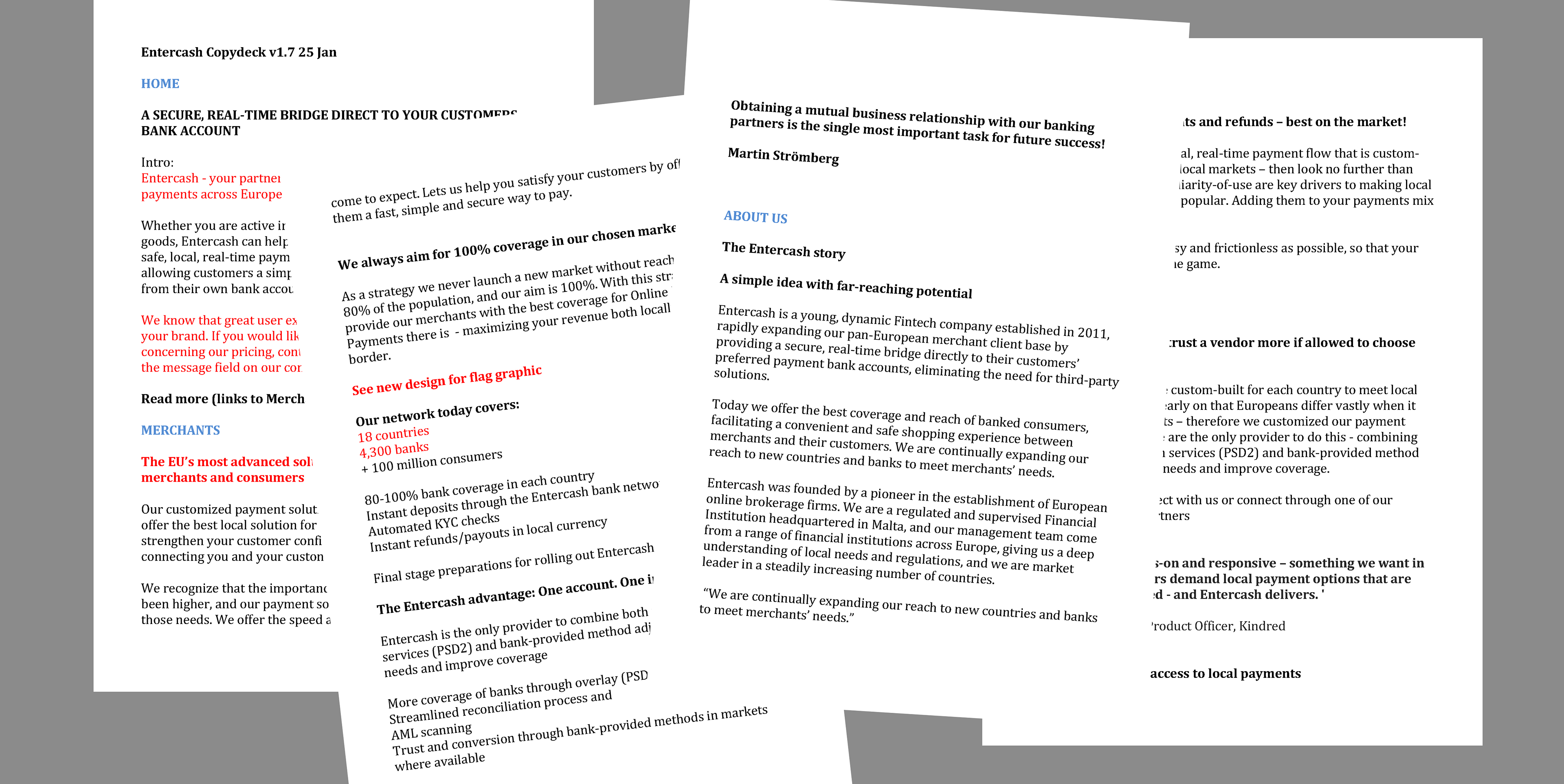
The copy deck was comprehensive, requiring a deep-dive into the product and the customer target audiences, as well as online purchasing behaviours.
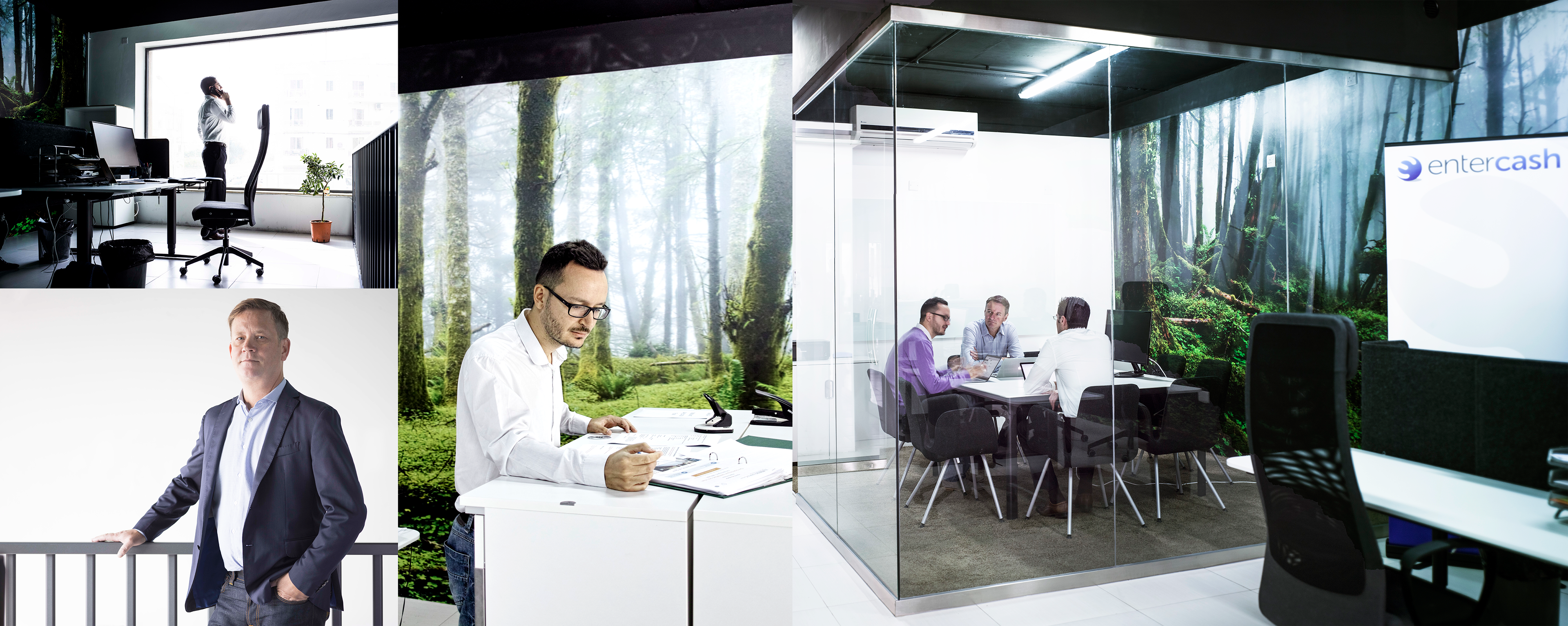
We also carried out a location shoot to show the human faces behind the Entercash brand.
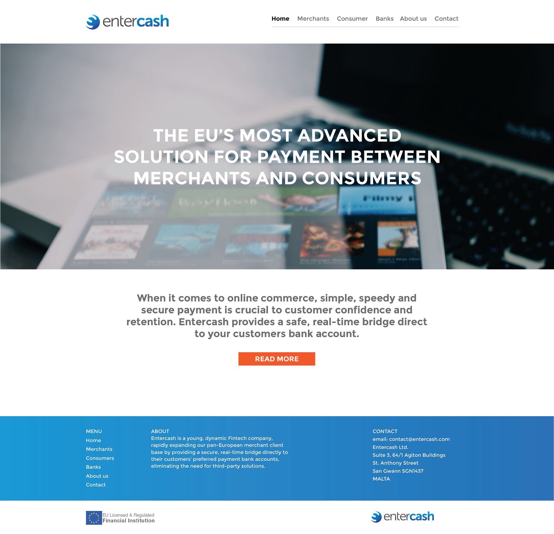
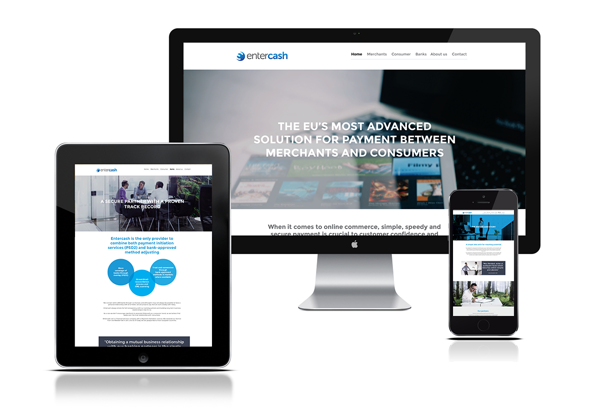
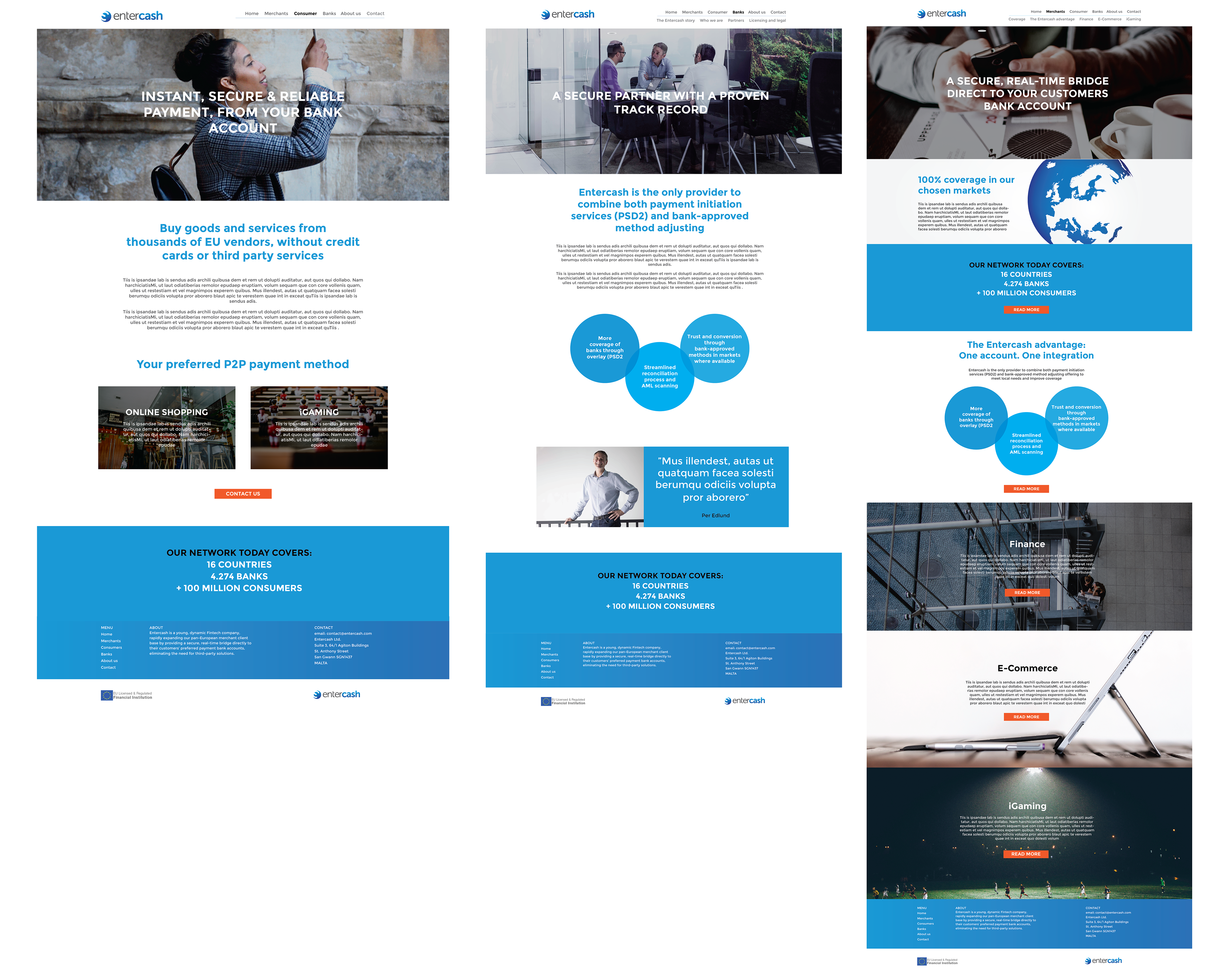
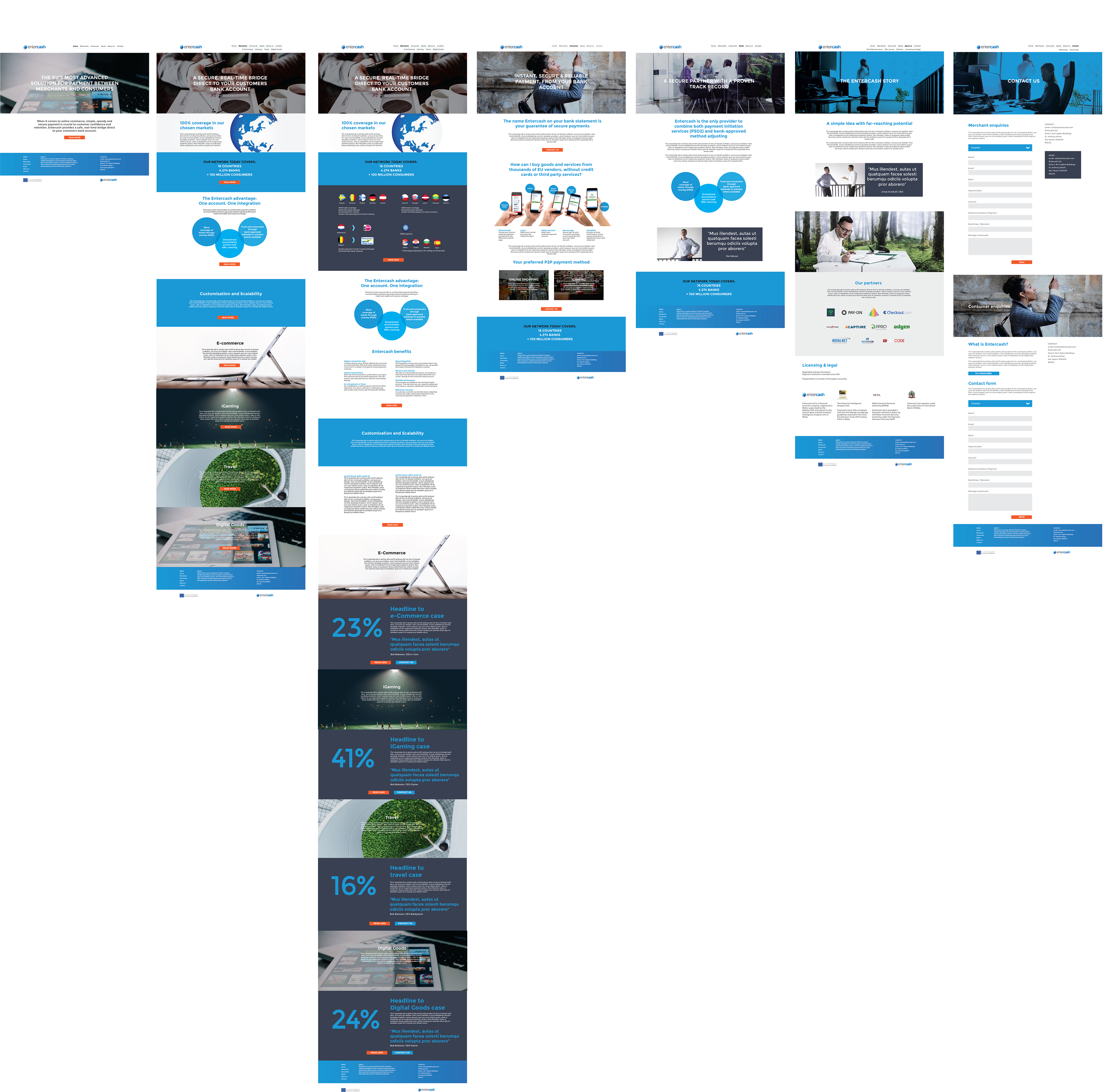
The final result was a clean, modern and responsive website, with content designed for three target audiences; banks, merchants and end-users. The colour palette and typography were chosen to give a sense of stability and clarity. Blue is a trust colour, often associated with banks and financial organisations.
I guess we did a great job, as in 2019 Entercash was bought by competitors Trustly.